Chil3’s Top 5 Tips for Choosing a Typeface
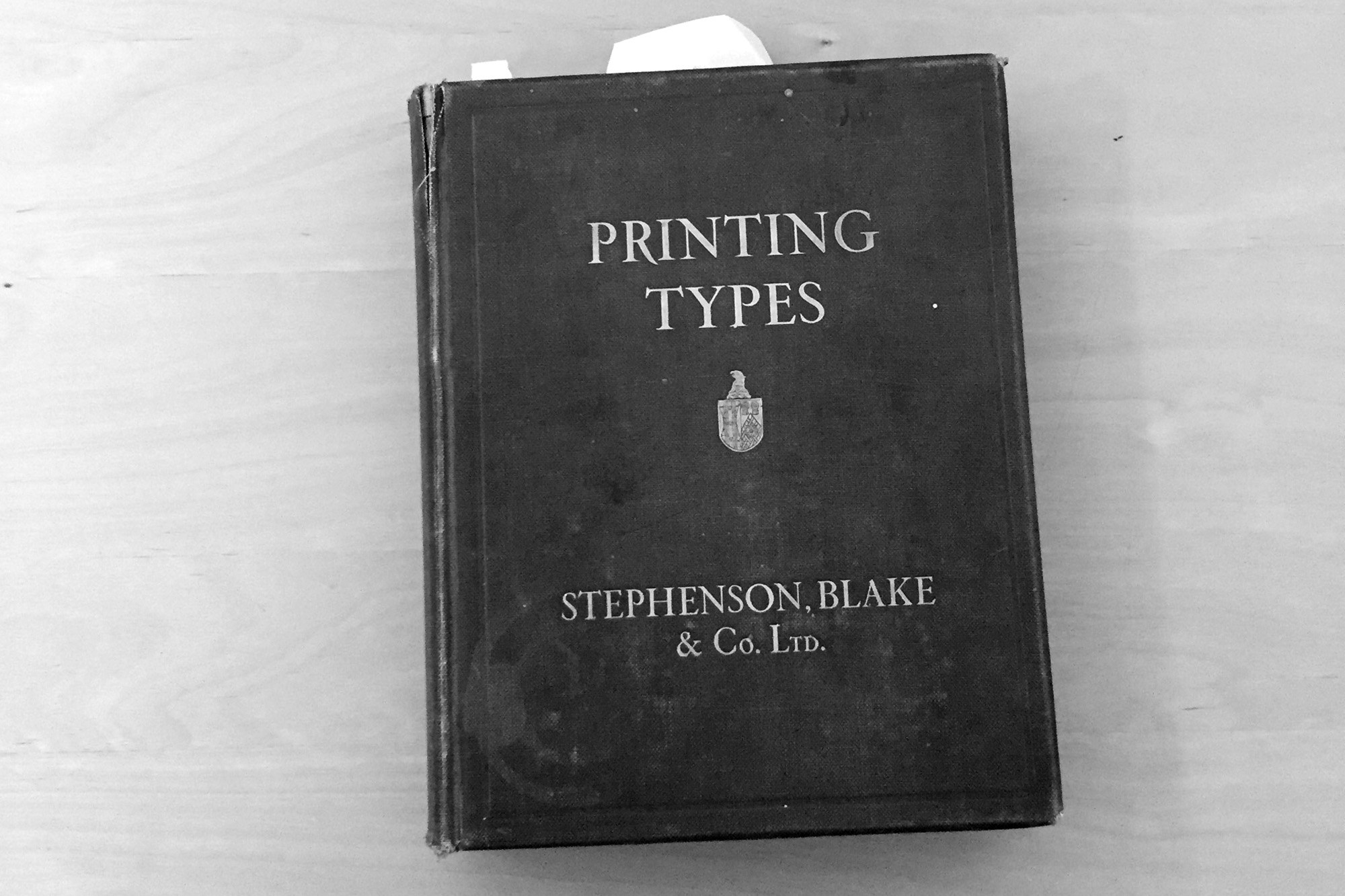
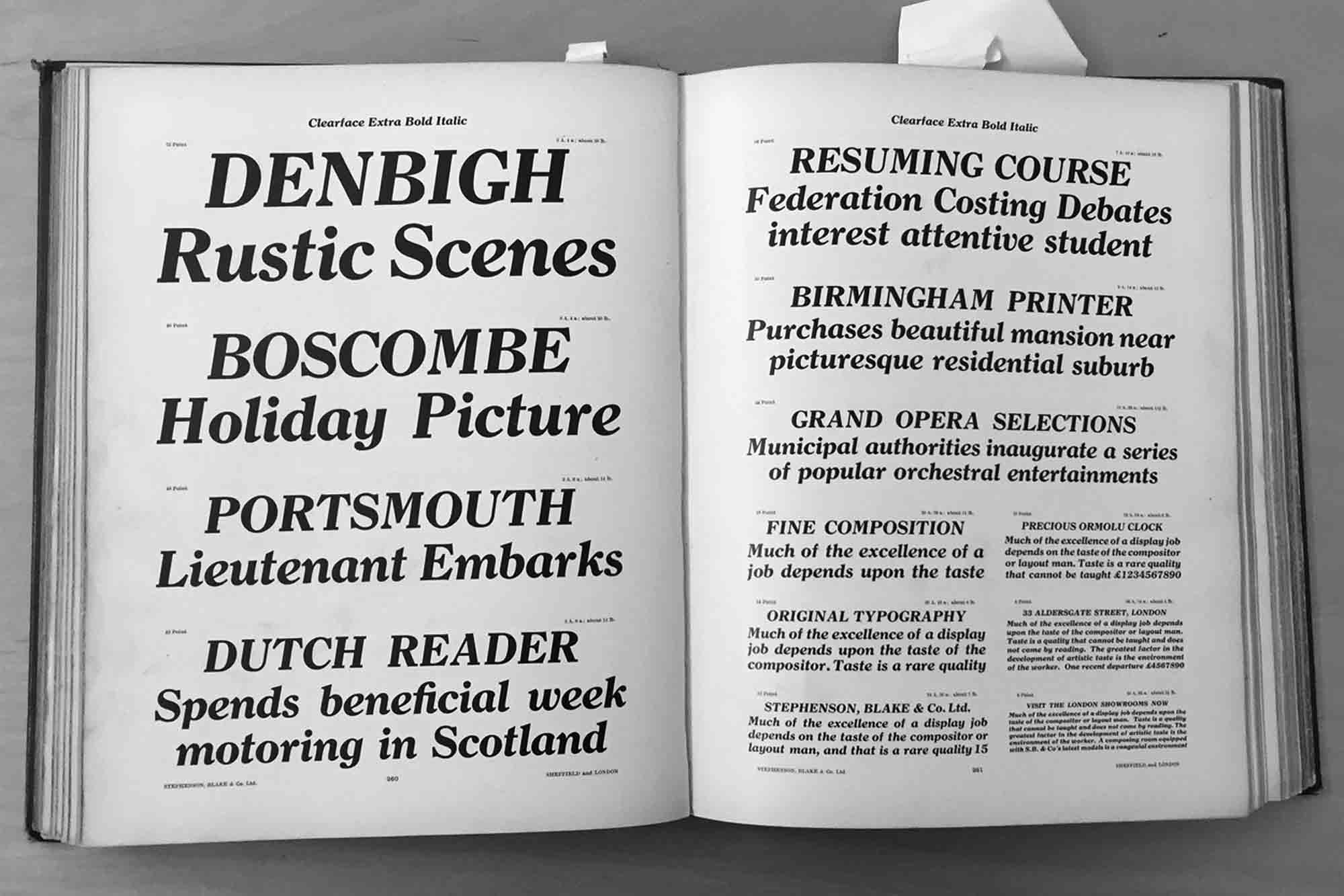
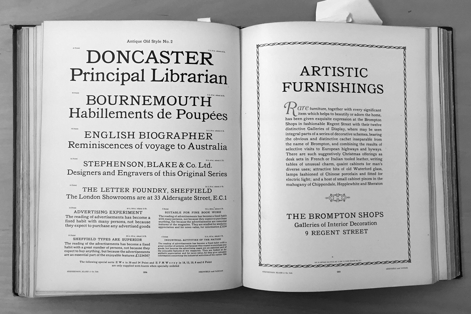
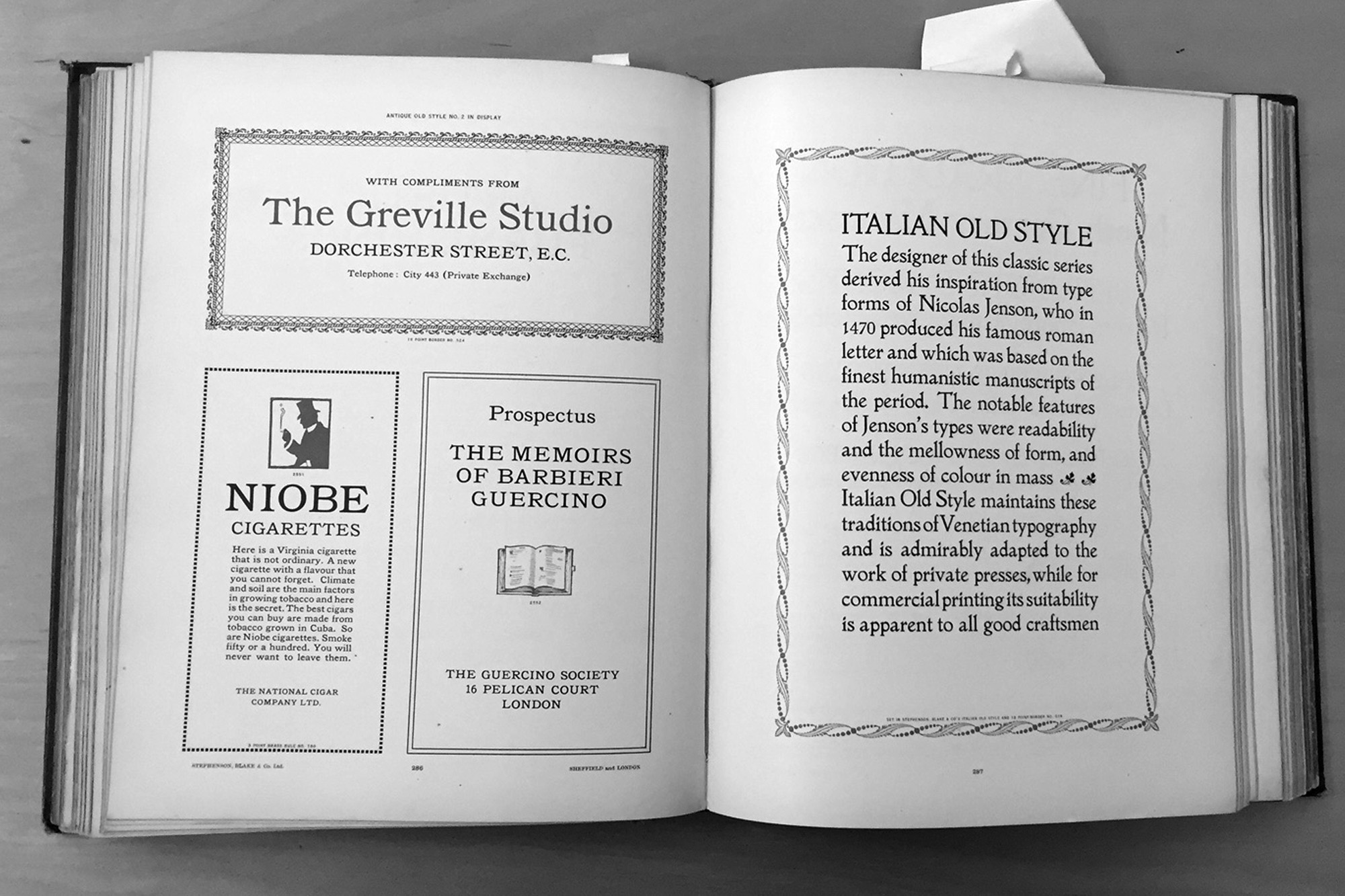
100 years ago we would have selected our typefaces from one of these print specimen books (above). Without so much choice, did we still struggle with choosing the right typeface?
Today at Chil3, we always carefully sift through the multitude of typefaces available to find what will work best for your project.
Type should aid communication and express character and style. We may not see the work behind good typography, but we definitely notice when it’s lacking.
Here are Becky’s top five tips for making the best typeface decisions.
1. What is the purpose of the typeface?
The first consideration is always … where and how will the typographic design be viewed? Is it a book, an online publication, a poster or a signage system? For example, a signage system will need a highly-legible, open typeface using title case. All capitals would be difficult to read, as would a typeface with very fine serifs. It may also need to be condensed to fit more information into a specific space.
Ornate display typefaces may be suitable for a book title on a cover, or for a brandmark or title treatment on a poster, but for text the primary function is legibility.
The purpose of the text is always the starting point and the primary factor in making a decision.
2. Has the typeface been tried and tested?
A typeface is often designed for a particular purpose. When working on a book design, consider which styles have been used successfully in the past, as many of our favorites today have a surprisingly long history.
An excellent example of this is Baskerville. Designed in the 1750s by John Baskerville it was first used to create high-quality books at a time when literacy was low, and books were expensive. Becky loves Baskerville as it still evokes a sense of classic quality, and for this reason it remains popular in the type community for use in branding identity, posters and publications.
3. What does it suggest to the reader?
Every typeface has a different personality. The design of each character has been meticulously considered, and when combined creates a distinctive look and feel. Depending on how it’s used, a serif typeface can give either a classical or contemporary feel to your design. When choosing a sans serif do you choose a highly functional type family like Helvetica or something a little quirkier like Bliss?
What does each typeface communicate to readers?
It is also important to consider which glyphs appear in your design, do you need numerals or diacritics? Choosing a typeface simply for its beautiful non-aligning figures is entirely acceptable. Use your designer’s eye to consider the overall effect of little choices like these that will have a big effect.
An historic typeface, Bodoni, synonymous with style and quality, is used for this book cover.
4. The value of economy and experimentation
When studying typography, we learn how to calculate the characters to comprise a line, then roughly work out how many lines fit onto a page.
Once your format and grid have been established always experiment with different typefaces as one may yield a much greater word count. When we re-designed Westerly Magazine, this was a significant consideration. With the same format, just a redesign of the grid and type gave us a more legible and economical result. We saved around 40 words per page. Imagine the difference in page numbers, and therefore cost, this would change in a lengthy book?
This is a valuable lesson in typographic economy that is often overlooked.
We chose Laski Slab for Westerly as it has a good word count at highly legible sizes.
5. Keep it legal
It’s worth noting here that copying typefaces is illegal. When you ‘buy’ a typeface, you are actually purchasing a licence to use that typeface and you will be asked how many sites (or computers) you require for your licence. If you are using a particular typeface for a branding project, your client will also need to purchase a licence to use the typeface. Licences are not transferrable.


